Ant Design System
A consistent design system built with a leading aerospace company — working closely with developers to turn designs into reusable products.
Overview
Worked with a leading aerospace company to create a consistent design system, working closely with developers to turn designs into reusable products. The system became the shared language between design and engineering — a single source of truth for components, patterns, and visual style.
The problem
Every time we started a new project or a new phase, components had to be created from scratch — which meant setting up a brand new component library each time.
We were designing the same components over and over, with the style shifting slightly to suit each project's functionality.
We needed to:
- Recreate old components.
- Gather all old use cases and define use cases for each component.
Aim
- Maintain consistency and uniformity across all projects.
- Make it more efficient and convenient for designers working across different projects in the company.
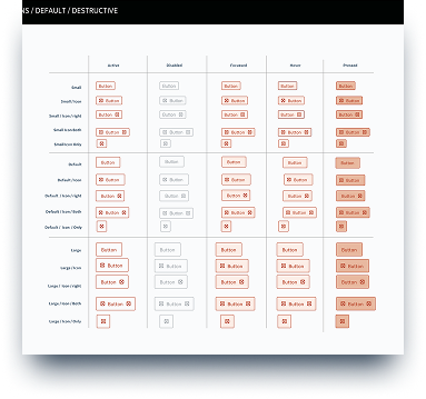
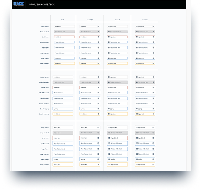
- Cover all scenarios — or "states" — in the system: hover, focus, filled, error, and disabled.
- Build responsive components so they could be reused when designing for different devices and layouts.
The benefits
- A single source to view components, patterns, and styles.
- New changes can be redesigned and managed at scale through the design system.
- Designers can spend less time tweaking visual details and more on complex problems and solutions — keeping projects consistent both visually and functionally.
- Faster replication of designs by reusing pre-made components and elements.
- Eliminates the need to reinvent the wheel and removes inconsistency between projects.
- Cuts wasted design and development time caused by miscommunication.
UX / UI methodologies & techniques
The work spanned research, design, and QA — making sure components held up in code as well as in mockups.
- Specific component UX research — focused investigations for each pattern.
- UI design — visual and interaction design across the component library.
- QA of implementation — reviewing built components against design specs.
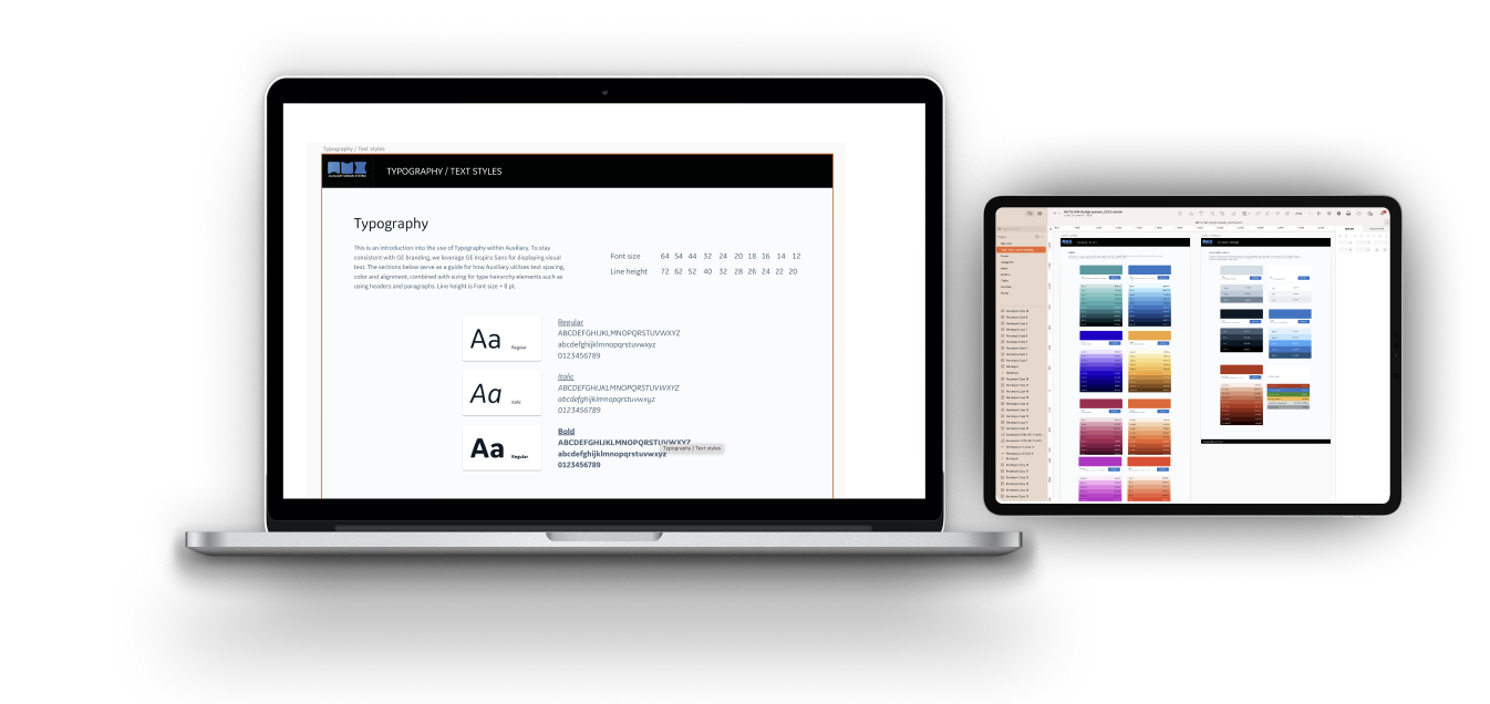
- Style guide — documented visual language, typography, spacing, and color.
- Pattern library — reusable patterns with variants and do's / don'ts.
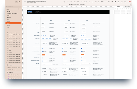
- UI inventory — cataloging existing UI to find duplication and gaps.
- UX audit — assessing flows for consistency and accessibility.
The approach
We started by creating a style guide for the system. Luckily this one had already been done — so we focused on implementing any new changes or elements and linking back to the existing style guide.
Design exploration
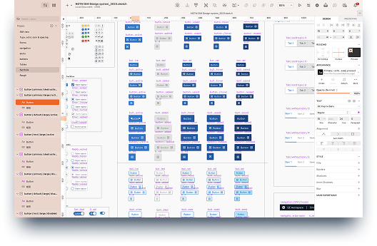
We focused first on the foundational elements (atoms) of our design system — color palettes, fonts, grid, spacing, buttons, etc. — then moved on to more complex blocks (molecules, organisms, templates, pages). Most components were built from scratch since many had to be edited to fit ANT guidelines, which served our design needs better.
Activities at this stage included:
- Researching other design systems and interfaces for common practices and inspiration, and creating an action plan for high-priority components.
- Analyzing the instances and use cases captured during the audit, and ideating on solutions that best served our goals.
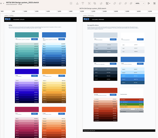
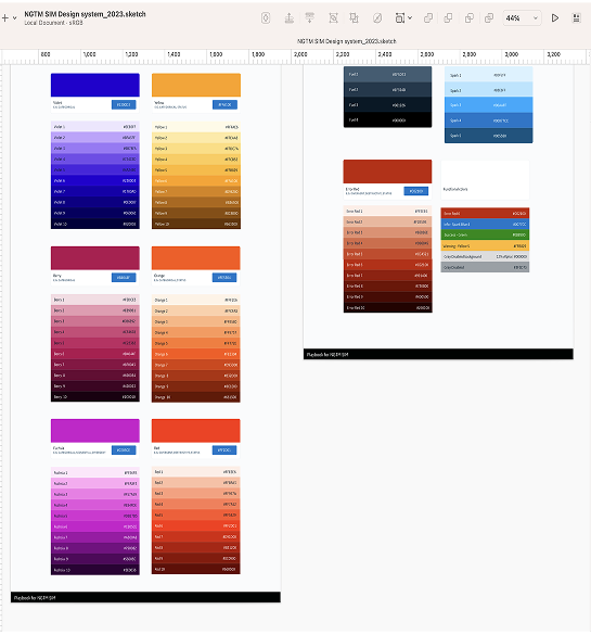
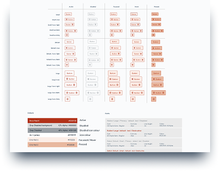
- Unifying — we merged variations of components down to the essentials. For example, we limited each color hue to a maximum of 10 shades; excessive variations were matched and merged with the chosen schemes by proximity.
Final color palette
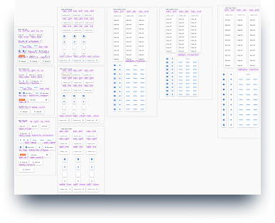
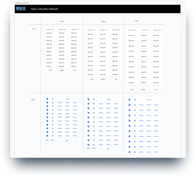
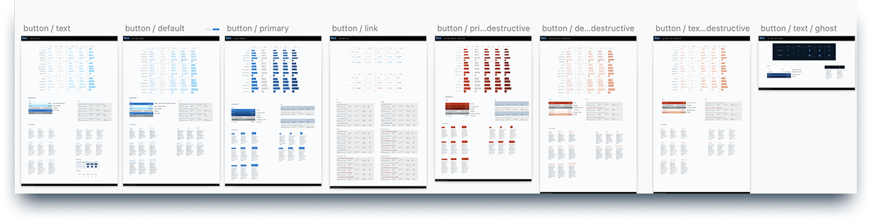
UI inventory
To better understand the current state of our existing design ecosystem, we started with a UI inventory of our main interface components, using ANT-V 14.3 Design System guidelines. Below are some examples of the components captured during the audit:
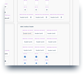
Documentation
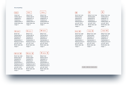
Documentation was always included on the same page as the component, to explain the use cases we'd defined. Each component's documentation contained:
- A clear explanation of paddings, margins, and states — documented right below the component.
- Rules and guidelines for when to use the component and how to use it.
Outcome
Add a paragraph here about what shipped and what changed because of it — adoption across teams, design-to-dev handoff time, or any concrete metric or feedback.